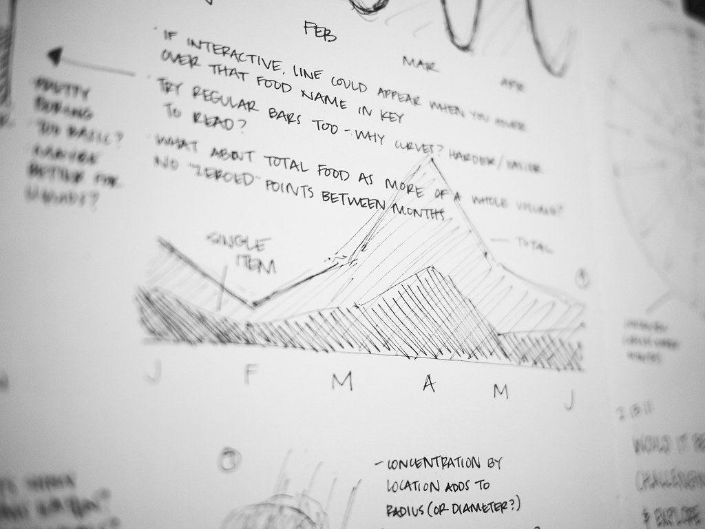
“Flatten the curve” was one of the most common visual representations to explain the evolution of COVID-19 worldwide. It also reflected on the response needed…
Leave a CommentAuthor: Rodrigo Cunha
Professor at Federal University of Pernambuco (UFPE, Brazil). Visiting researcher at University of Malaga (Spain). Talks about digital journalism, dataviz, and accessibility.
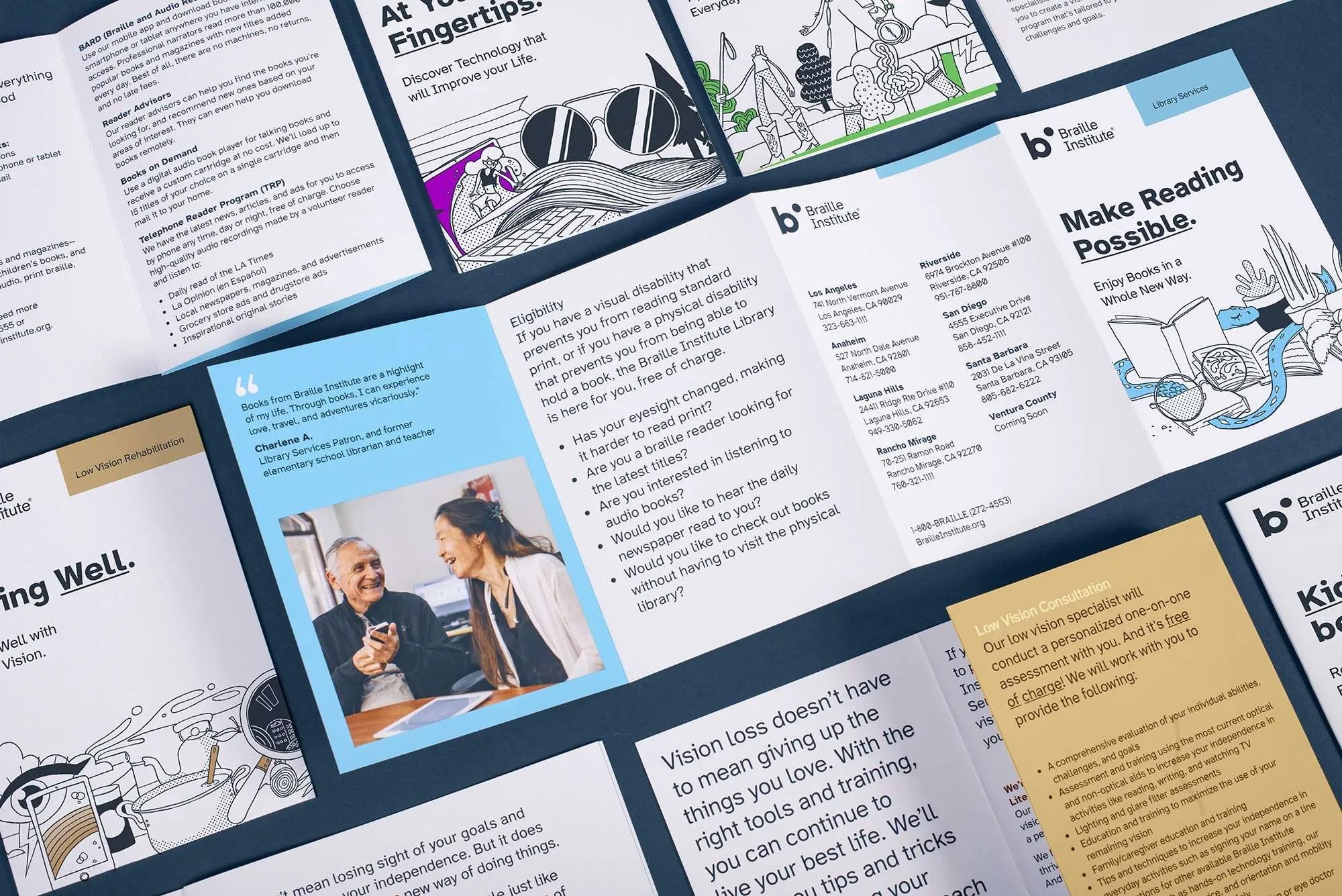
The project’s website adopts, starting today, a new typography: Atkinson Hyperlegible. The font was specifically designed to increase readability for readers with low vision. Atkinson…
Leave a CommentThe use of data visualization has exploded in recent years. It is a resource widely used by the press, the government and other organizations to…
Leave a Comment

