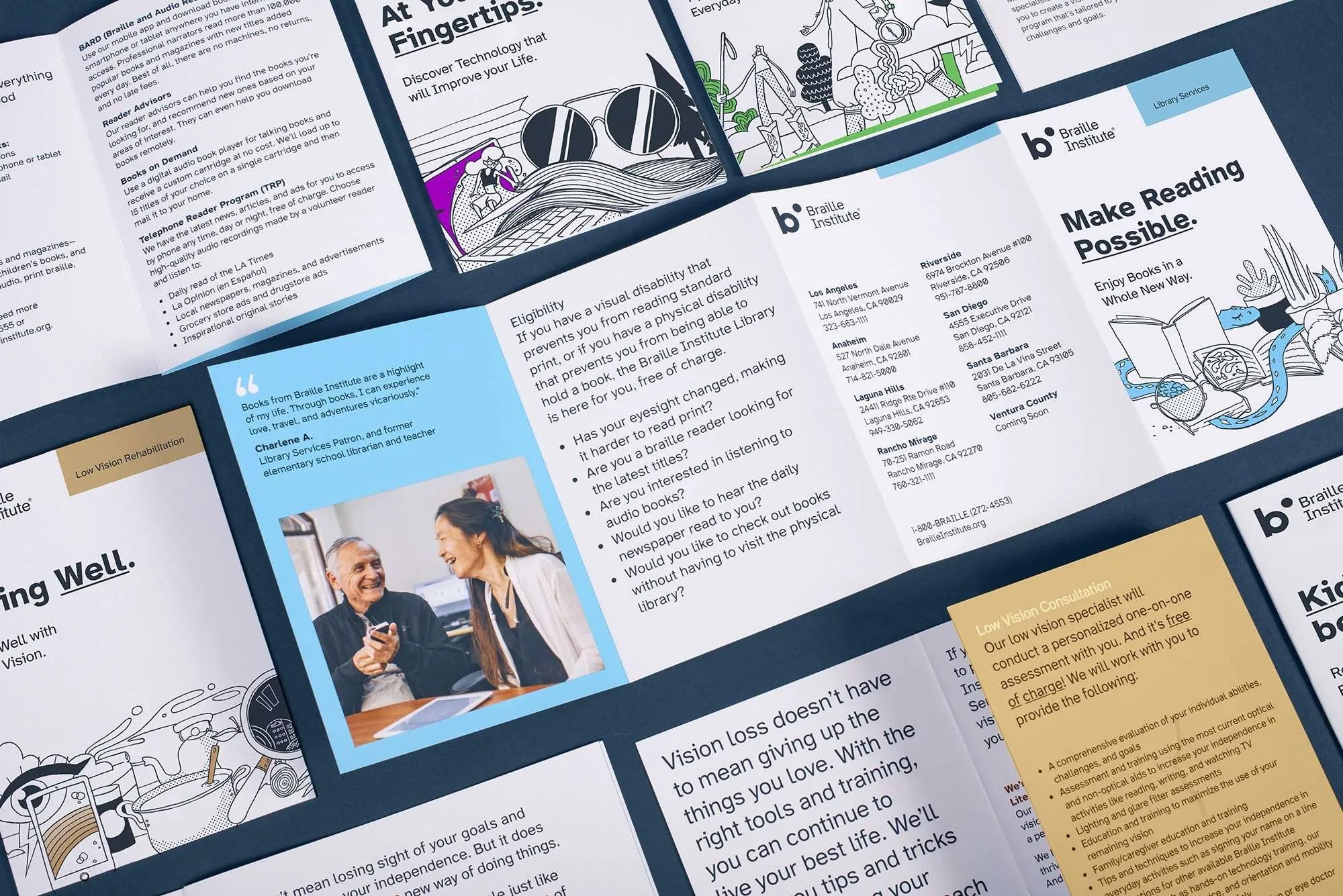
The project’s website adopts, starting today, a new typography: Atkinson Hyperlegible. The font was specifically designed to increase readability for readers with low vision.
Atkinson is named after the founder of the Braille Institute in the United States, the institution that developed the project. The sans-serif style allows you to increase character recognition without details that hinder the reader’s understanding.
The use of typography was allowed thanks to the support of Google Fonts, which allowed greater dissemination and used with free access.
More information: https://fonts.google.com/specimen/Atkinson+Hyperlegible


Be First to Comment